• Skip to main content
  • Skip to footer

D. Hart St. Martin

I make female heroes badass AND believable

  • Home
  • Hart Land
  • The Library
    • Lisen of Solsta
      • Fractured
      • Tainted
      • Blooded
    • Soul Doubt
  • Notes from the Hart
  • For your pleasure

independent publishing

A Cover, A Cover–My Kingdom for a Cover

January 18, 2014 by D. Hart St. Martin 1 Comment

When I set out on the journey to share Lisen of Solsta’s journey with anyone who would listen, I really had no idea what I was in for. All I could see was that independent publishing meant I didn’t have to write any more query letters, that no agent or publisher would send me one of those one-size-fits-all rejection letters ever again, and that the control was all in my hands.

Well, not quite.  Self-publication requires a multitude of skills beyond just writing.  Here are a few of them:

  1. More-than-amazing proofreading skills and the patience to do it just one more time.
    Or…the money to pay someone else to proofread it for you, someone you trust or someone a friend knows and trusts.
  2. A knowledge of what Word can do and the willingness to follow the suggestions on your print-on-demand (POD) publisher’s web site in order to make the print copy look professional.
    Or…the money to pay someone else to format it for you, after which you must make sure they formatted it to your specific instructions and it looks the way you expected it to look (unless they have a logical explanation for why they did it differently, of course).
  3. An average intelligence in order to fill out the forms for the POD publisher, making sure the name of the book is correct, you’ve included all pertinent authors and contributors, and have chosen tags that will call others to your book when they search.  (And don’t forget your cover artist as one of those contributors—see #4 below).
  4. The artistic expertise to create a stunning and seductive cover.
    Or…the money to hire someone to collaborate with you, listen to your ideas and then bring them to life.

It is this last item I have opened up Word today to address.

I wrote my first book, Fractured, with a great deal of care. I rewrote it and rewrote it, submitting it over and over to the writing workshop I trust with my life, and when I’d reached the magic moment of READY, I did everything listed above.  Except for the cover.  I used a template from my POD publisher and a painting that was in public domain.  It wasn’t a bad cover; I did a fairly good job at it.  But it wasn’t the sort of cover that attracts young people, and my book was YA fantasy.

And it bombed.  Big time.  Fractured was named an IndieReader.com Best Indie Book of 2013, but I think I sold no more than a dozen copies.  I did get 5-star reviews from everybody who read it, but they were all friends and family, save for that IndieReader.com review (also 5 stars).

There was a disconnect.  Great book, no response from potential readers.  What was the problem?  I’ve written before about how even the larger details of marketing elude me, but I do keep getting myself and my books out there.  No, the disconnect was that adequate-but-uninspiring cover.

So…I hired a cover artist—a good one.  I had her start on book 2 (Tainted) so I could get that one published.  She did a wonderful job.  See?

 Image

A couple of weeks after Tainted’s publication, my artist, Aidana WillowRaven, asked how we were doing in sales.  Nowhere.  I hadn’t wanted to look because I knew it wasn’t doing that well.  Who’s going to buy the second book in a series if they haven’t read the first one, and clearly few people had read the first one.  I came clean with Aidana and said that things might go much better if we got the first cover done and out there.

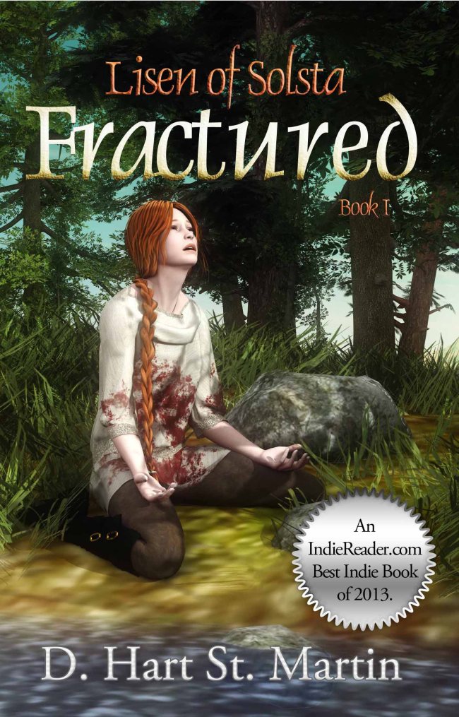
So now I’m on the line.  The new cover for Fractured is finished and available on Kindle.

Image

Gorgeous, isn’t it?

The paperback is another story.  Between typos in the back cover copy due in part (only in part) to making modifications too quickly to proof it properly and my dear POD publisher’s digital proofer somehow making the cover look like a printer somewhere had run out of ink, I’ve had to submit the thing, so far, a total of three times.  Aidana remained loyal and committed to getting it right and spent most of an entire day on my project when she could have been moving on to other work.  Heaven and the Goddess bless her.

Here’s my point.  Spend the money on a cover artist.  Find someone you can work with, someone who cares, someone who will put their arm on your shoulder and tell you they are your collaborator and they want it to be perfect as badly as you do.  In the beginning, I couldn’t afford this, and many who read this won’t be able to afford it either.  But spend as much as you possibly can.  Go as high as you can to get the best you can afford.  Look for sales, look for discounts, whatever it takes.  Because a book is like a beloved child, and first impressions do count.  If it’s truly good enough to publish, it deserves the very best you can give it.

Filed Under: Self-publishing, Uncategorized, Writing Tagged With: coming of age, cover art, cover artist, fantasy, female hero, independent publishing, self-publishing, writing

Judging a Book by its Cover

October 23, 2013 by D. Hart St. Martin Leave a Comment

A year ago, I published Fractured, the first book in the Lisen of Solsta trilogy.  At that time, I couldn’t afford to hire anybody to do anything for me, so I edited, proofread and formatted the book for both print and e-book myself (see the 2-part “Beware of Falling Rocks along the Learning Curve” below).  I also designed the cover, using CreateSpace’s template and inserting Waterhouse’s “The Lady of Shalott” for the picture because the subject of the painting appears appropriately “fractured.”  It was a decent cover, considering my good eye for layout but my nonexistent abilities as an artist.

cover4blog

Here’s the problem, however.  It’s a great cover for a historical novel.  Adults, in the main, tend to appreciate the clean, unflashy lines of a pre-formatted book cover.  On the other hand, YA (young adult) books require something much flashier to grab the attention of teenagers.  You have to dazzle them with color and seduce them with something a little sexier than a painting in the Pre-Raphaelite style, even if that painting is a classic.  In other words, the cover was boring.  Beautifully executed…but boring.

Enter the idea of hiring a cover artist.  I began my search for a cover artist back in March.  My quest began with a woman who designed from stock photos.  She created excellent covers, great for romance novels and the like, but Lisen required a specialized touch because she’s not quite human.  I moved on.  My second potential cover artist used photographs, but what she did with them was incredible.  I loved her work and made an appointment to start working with her a couple of months after our first contact (her first free moment).  I couldn’t wait.  I was all worked up and excited.  The time came, I e-mailed her and asked if she was ready, and she begged off—too busy and my concepts were too complicated.

Sigh.

I tweeted and posted to Facebook the details of the horns of my dilemma.  Aidana WillowRaven tweeted me back and offered her services.  I knew I was about to come into a little extra money, so after we chatted online for nearly an hour, we struck an agreement for all three books.

It took time, more time than I’d anticipated.  But I began to recognize the difference between someone who Photo-shopped stock photos and an actual cover artist and designer.  It was a collaborative effort.  I described Lisen to her, and she created a first draft of what she saw based on my description.  I critiqued that initial effort and requested changes, and in the second draft, Lisen took form.  It’s amazing how I felt looking at her in that draft.  She looked nothing like what I’d pictured for years during the writing, and yet she was Lisen.  My Lisen.

The drafts moved on through clothing, the pouch (eventually eliminated from the first cover completed, the cover for Tainted, the second book in the trilogy), and finally the setting.  This last Sunday morning, Aidana and I both signed off on the picture, and on Monday I had the remainder of the cover for the print version.

I am thrilled.  I’d say thrilled beyond words, but I seem to be having no  difficulty finding them at the moment.  We will start work on book 1 very soon, and I hope to reissue Fractured before the end of the year.  In the meantime, I have begun writing book 3, Blooded, and plan to publish it sometime in 2015.  Have hope, fans.  I’d set a 2014 publication date for Tainted, and I’ve come in early on that one.  Maybe Blooded will write itself and be ready for publication by the end of 2014, but I don’t want to make any promises I may not be able to keep.

So, here it is—the reveal.  Ladies and gents, meet the gorgeous, seductive cover of Tainted, available in both print and electronic editions and due to hit a retailer’s web site near you in early November.

front cover shot - low rez (2)

Filed Under: Uncategorized, Writing Tagged With: book cover art, DYI publishing, independent publishing, publishing, self-publishing, writing

Beware of Falling Rocks along the Learning Curve (Part 2)

September 27, 2012 by D. Hart St. Martin 2 Comments

As a too-poor-to-pay-them-to-do-it independent publisher, every decision was left in my hands.  Some indies say this is one of the main reasons they chose this route.  Others will tell you that it had more to do with royalties, typically a much higher percentage when dealing with a POD than a traditional publisher.  I made this choice, as I wrote previously, because I wanted my book read and that wasn’t happening via the query-and-wait process.

But here’s the thing I discovered on the way to doing it all myself—I like making those artistic decisions.  For one thing, a traditional publisher would likely have balked at my using two separate fonts.  It’s a lot of extra work, and the way I had it set up originally (for a manuscript) did increase the work on my end.  I had used Times New Roman 12 pt for the great majority of the text (what I call my “Garlan” font) and Century Gothic 10 pt for the “Earth” font.

CreateSpace, my POD publisher, provides advice on a multitude of publishing topics, and one of them is font choice.  The font I wanted for the Garlan font was Book Antiqua 11 pt.  I liked how it looked.  It was not one of the fonts CreateSpace recommended.  But it did, in my opinion, fit the criteria they laid out for a good book font.  One problem solved.

I then began looking at fonts for “Earth.”  I had my own criteria for these.  First, the font I chose had to look dissimilar enough to Book Antiqua to be discernible as something different.  Second, it had to match Book Antiqua size-wise at 11 pt so the reformatting from one set of fonts to the other would be simplified for me by one step, allowing me to change an entire chapter to 11 pt before proceeding with other formatting changes.  And third, the italics in the “Earth” font had to stand out from its own regular version and look like italics when standing as one or two words in the middle of the “Garlan” font.  In addition, the space between lines had to match between the two fonts.  (You’d be surprised how many fonts leave huge amounts of space between lines.)  Kabel BK BT fit the bill.

So, if I haven’t totally bored you with all of that, let me move on to the cover.  I’d had a very unsatisfying experience with the cover of my book with my first POD publisher back in 2000.  Their first design—mind you, for a fantasy novel with a medieval/almost Roman setting—looked like the cover of a psychological thriller, all reds and blacks and harsh images.  I cried.  They offered to redesign it.

The second cover had my shero in a long flowing dress looking quite distressed as a young man, presumably her brother, threatened her with a sword.  Clearly a heroine in need of saving, not a strong young woman capable of saving herself.  This time I begged them to take mercy on me and try again, admitting that if I must, I would accept this cover, but must I?

I did eventually accept their third attempt, a nondescript, stock photo of a small Greek-looking ruin on a hill—but only because it didn’t offend the crap out of me.  It said nothing about the inside of the book, but it didn’t lie about the inside of the book either, and for the $99 I’d paid for them to do everything, I couldn’t ask them to do it again.  I just couldn’t.  I also couldn’t market the book.  How can you get enthusiastic about something so mundane and boring.  Here it is:

See what I mean?

This time I didn’t want to end up with something I couldn’t live with.  I wanted to give it my all.  But I was flummoxed.  I can’t paint or draw.  I don’t know how to make a photograph look like a painting or modify it to get rid of boobs on a female model (you’ll understand why that was important when you read the book).  I looked at fantasy book covers on Amazon and looked for the name of the artist inside.  Perhaps I’d be able to Google one who didn’t charge an arm and leg for a good cover.  Then I came across one I liked, and it turned out it was an old painting.  Public domain!  Find a painting by a painter who died more than 70 years ago and I’m home free.

But what painting?  I sat at my table and looked around my living room.  Van Gogh?  No.  Picasso?  Not dead long enough.  Then, I remembered.  Over my right shoulder behind me hung a print my sister had given me a very long time ago.  “The Lady of Shalott” by John William Waterhouse who died in 1917 one month before my father was born.  That was 94 years ago.

It was a painting of a woman clearly fractured emotionally.  She had red hair like Lisen—long and curly like hers, too.  It wasn’t until later (but before I finalized all my decisions) that someone pointed out one minor problem.  She had breasts.  But I hadn’t chosen this painting because she looked like Lisen; I’d chosen it for the emotions it evoked.  And for the way it popped on the cover I’d designed with the help of CreateSpace’s template.  I liked it and I kept it.

And that’s how I made sure my vision of Lisen and her story was maintained throughout the final product.

Filed Under: Writing Tagged With: independent publishing, young adult fantasy

Beware of Falling Rocks along the Learning Curve (Part 1)

September 22, 2012 by D. Hart St. Martin 4 Comments

So now I’m writing a blog, and I have no idea what I’m doing.  Of course, I could say that about a great many things I’ve done in the last few months.  Independently publishing a novel brings with it a series of learning curves with falling rocks around each one—falling rocks which must be driven around, drilled through, climbed over or tunneled under.  So why should a blog be so different from anything else?  (Or a “blob” as I seem to keep typing it.)

It began with a series of negative responses to e-mail queries.  In the old days, I sent out five letters a week—including synopsis and/or sample chapter(s) depending on requests—with the obligatory SASE (self-addressed stamped envelope) and then waited, sending out another five the following week.  Without access to an agency’s web site, an author had to rely on what the current year’s guide said about them. 

These days, one researches the agent, peruses her recent sales, studies the submission guidelines, and learns, in all too many cases, that one agent seems to sell only ethnically oriented books, another seems to handle very little or no fantasy even though the guide says they do, and a third has shut down accepting submissions for an indefinite period of time but “please do check back with us in a year or two.”

The good news about this is that the writer can reject many, many agents who don’t fit her needs.  It does, however, limit the hope factor.  It also limits how many queries go out because so much time gets spent on eliminating the hopeless.  The one thing it does not limit is the response time.  Some rejections arrive within hours of the queries having been sent.  In the meantime, the psychology of juggling queries—of always having several out as the rejections come in—that psychological incentive gets lost when the negative response is so final in its immediacy.  I quickly became discouraged.

One day in July, I woke up to what I really wanted for this book I’d pored so much energy, time and love into.  I wanted it read, in its entirety, by someone who felt no imperative to like it.  No imperative to hate it either.  I couldn’t get an agent to read it.  For some reason, my queries fell like the great silence that overtakes a stadium when a player is injured.  My book was hurt, and I had to find a way to resuscitate it.

Enter independent publishing.  Enter print on demand (POD).  And enter contests for self-published books which guarantee a full read by an expert—agent, publisher, writer, whatever—someone who has no need to like me or my writing.  Literally, ENTER those contests.  This would require doing more than preparing the manuscript for digital publication; I would have to prep it for paper and binding. 

Luckily, I came to this with skills already in place.  I’d self-published twice before—once doing all the set-up myself and even binding the books with my father’s guidance, and once via a POD publisher for whom I had to prepare the document, but I did not have to make decisions such as type face or the size of the book and I did not have to design the cover.

Near the end of July I began prepping my manuscript.  I proofed, and two readers pointed out a few errors as they read the book as a document on their Kindles.  I made some changes and then performed a series of edits on each chapter to accommodate the differences between manuscript and book.  I will get into these in the second part of this blog, but it was an intense process. 

It was also a satisfying process, one which gave me control over everything, and nothing can beat that.

Filed Under: Uncategorized Tagged With: independent publishing

Post? Page?

September 22, 2012 by D. Hart St. Martin 3 Comments

Can’t tell the difference between a post and a page.  Just trying things out here.  If you’ve already read my first “page,” you’ve read this.

I’m a blogger!  Been threatening to do this for years, and, finally, here I am.  Admittedly, I have taken this step to establish a presence on the internet, and I hope that a few people will show up to check out what I have to say.  I love to write and have been doing so since I was in grade school.  I thrive on the challenge of a story that requires delving into the darkness in our souls, and I work hard to meet my own admittedly perfectionist standards.

I am here because of Lisen.  Lisen is a friend of mine.  We grew up together, in a manner of speaking.  She taught me what it means to lose everything and come back fighting.  I showed her what life on Earth was like, and, in turn, she has rewarded me with some of the best moments an author could ever ask for from a character.  Now it’s time for her to venture out into the literary world, and I want to do everything I can to help her succeed.  So here I am.

The book’s name is “Fractured: Lisen of Solsta, Book 1,” and it is available on Amazon in both hard copy and Kindle.  This blog will often delve into Lisen’s world, but I also hope to look at writing in general, the pros and cons of independent publishing versus the traditional publishing route.  When the need drives me, I will also write about the dilemmas of life as they strike me.  I know it will take a while to build a following.  This first blog is not likely to attract followers in droves, but it is a start.  Show  up in a week or 2 and hopefully I’ll have something to say that’s actually worth saying.

Filed Under: Uncategorized Tagged With: independent publishing

Footer

  • Privacy Policy
  • Contact

Social

  • Facebook
  • Twitter
  • @hartstm@counter.social
  • Instagram
  • Eowyn’s Bard

Copyright © 2023 D. Hart St. Martin